Cappuccino...and Inks? A Perfect recipe for Inktober!

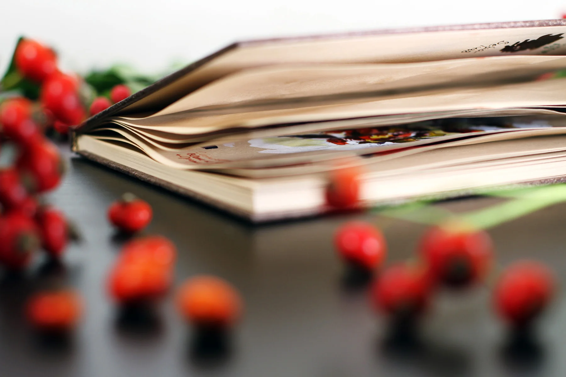
Cappuccino with soya, lactose-free or almond milk, hmm. Today everything is possible and even a...Cappuccino Book! Although I'd love to use a paper block all the time there are just special projects when sketchbook is merely indispensable. Some artists even turn sketchbook slowly into art object itself.
Inktober is upon us! This time I had a lucky chance to try the new product from a German manufacturer Hahnemühle and can't wait to share some illustrations for this year's challenge.
If you love inks as much as I do you've probably heard of Inktober (read about this challenge here ) and so I decided to try this new coffee friend to keep me a company.

The first impression (and we all know how important that is) was beautiful. The paper quality and hardcover with a bookmark make it pleasant to hold. And of course, the color of the pages is warm and matt.
Before the start it's always a great idea to test the medium right on paper, and here are the swatches I've made with acrylic inks. So even before the start I already had the idea of paper texture, how it behaves with chosen inks and how fast it takes for inks to dry. Drops are made straight from the pipette (brave, right?:) and pigment titles are written with a classic nib pen.


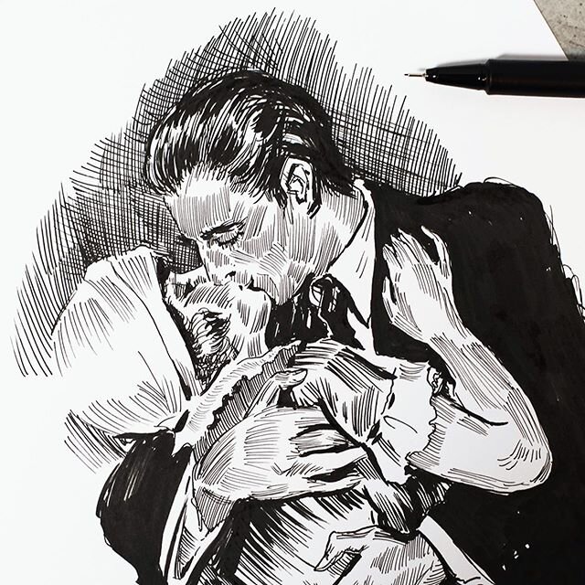
Inspired by masters of fashion illustration I did a quick study using several layers of inks and the paint dried suuuper fast. Indian-Ink dried up in seconds while acrylics needed some more time.


When applied more than five layers the paper begins to wrinkle which adds this professional feeling of the old manuscript which I personally love a lot.
I wouldn't recommend working in this sketchbook with watercolors or water-soluble medium which needs a wet surface (like wet on wet technique).
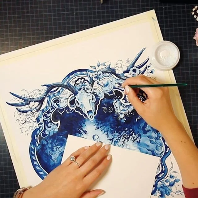
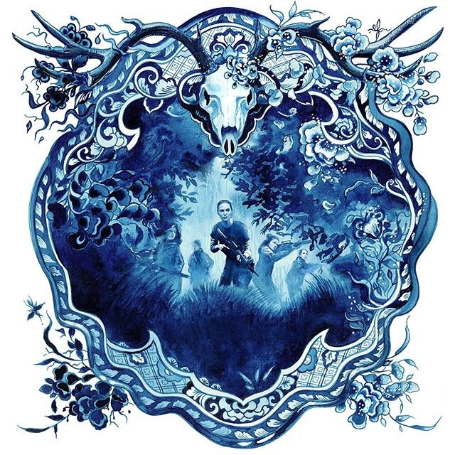
The second prompt for Inktober was this little forest friend. I could finally try opaque white and see how the paper allows highlighting the areas. Considering the warm-color surface, I picked blue shades to pup up. Even white inks worked out great (most often you need to use white gouache to get enough coverage).


Several layers on eyes + final glazing with semi-transparent yellow look perfect.

The overall experience is excellent and here are some pros and cons (that is my personal opinion of course).
Pros:
- Paper works perfectly for inks and dries super fast
- The pages color is very soft and classy
- Holds the masking tape really great (yay!)
- Thin enough for light table and image transfer
Cons:
- Not suitable for wet-on-wet techniques and if you like the pages to be perfectly smooth after the painting is finished.
- The too liquid and intense medium can leave marks on the back side of the page


Hope you find this review helpful. During this month I plan to experiment with different mediums and already excited about it!
Did you know I teach some classic and modern techniques online on Skillshare ? You can check my classes and learn something new!
Let's put our creative hats on and enjoy the beauty around us!