The Illustrator’s new friend: One paper for any technique
I’m often asked about what paper I use for my design and illustration projects I thought it’d be nice to make an in-depth introduction of my new and already constant friend—Bristol paper by Hahnemühle.

As I’m often asked about what paper I use for my design and illustration projects I thought it’d be nice to make an in-depth introduction of my new and already constant friend—Bristol paper by Hahnemühle. With 20 pages of ultra-smooth but sturdy surface the Bristol paper is the perfect choice for design and illustration projects allowing working with dry and fluid drawing media at the same time.
Keep in mind that this is my personal opinion and refers to how I work, although I believe you’ll find it helpful. I combine traditional and digital techniques so considering the diversity of projects and strict deadlines Bristol is a wise choice.
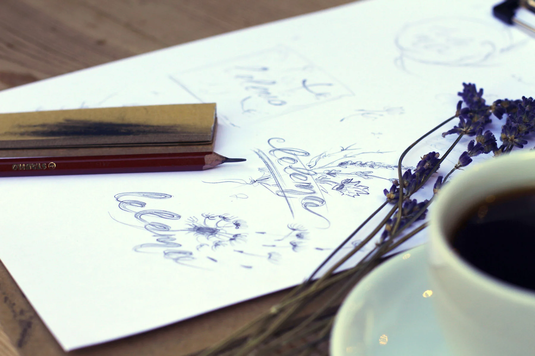
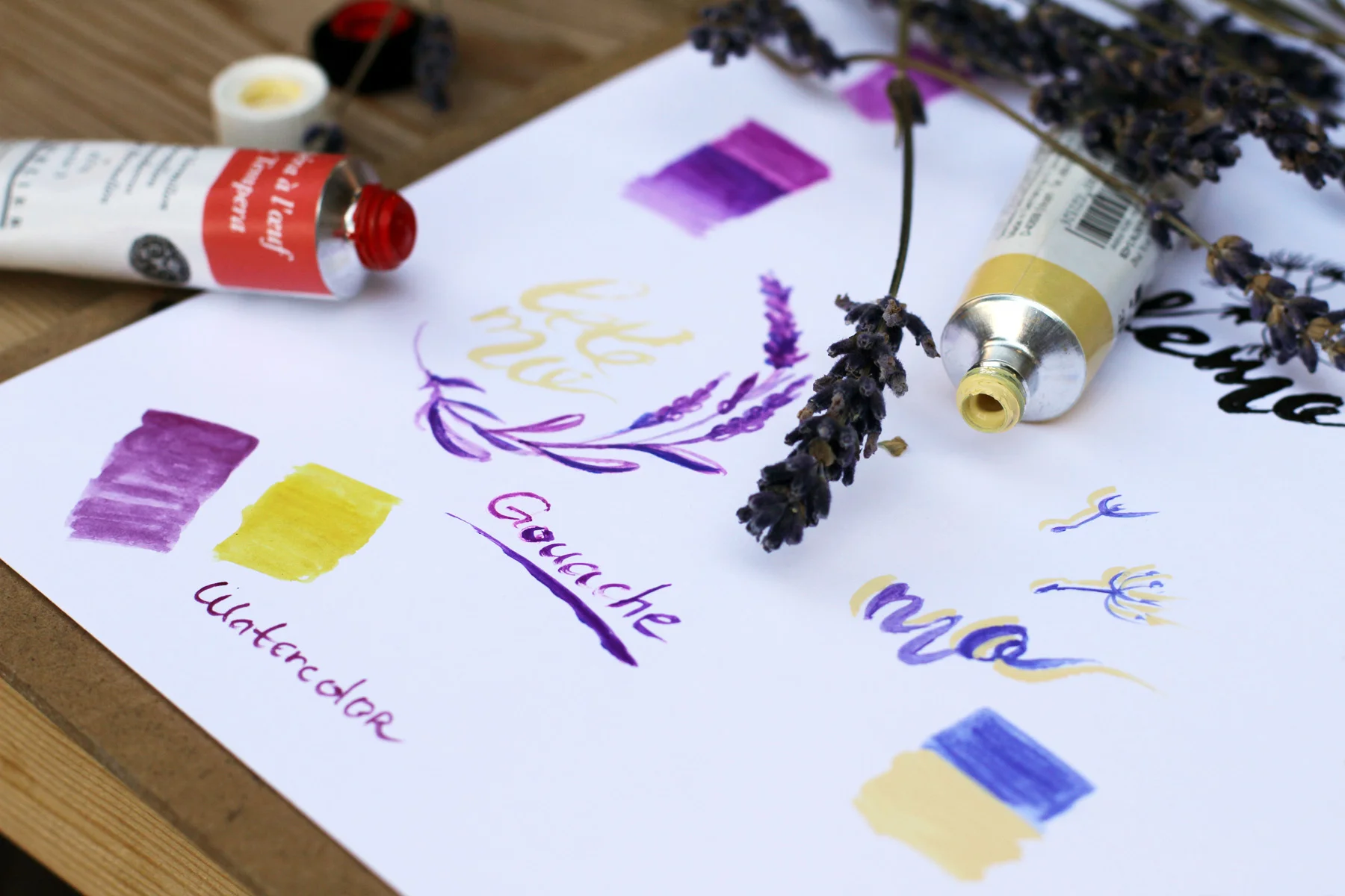
I decided to show it “in the field”—logotype project for a small business company called Lelemo (natural handmade souvenirs). Lavender was an inspirational symbol and I started with pencil sketches directly on Bristol paper (while instantly inhaling the fresh lavender flowers aroma)

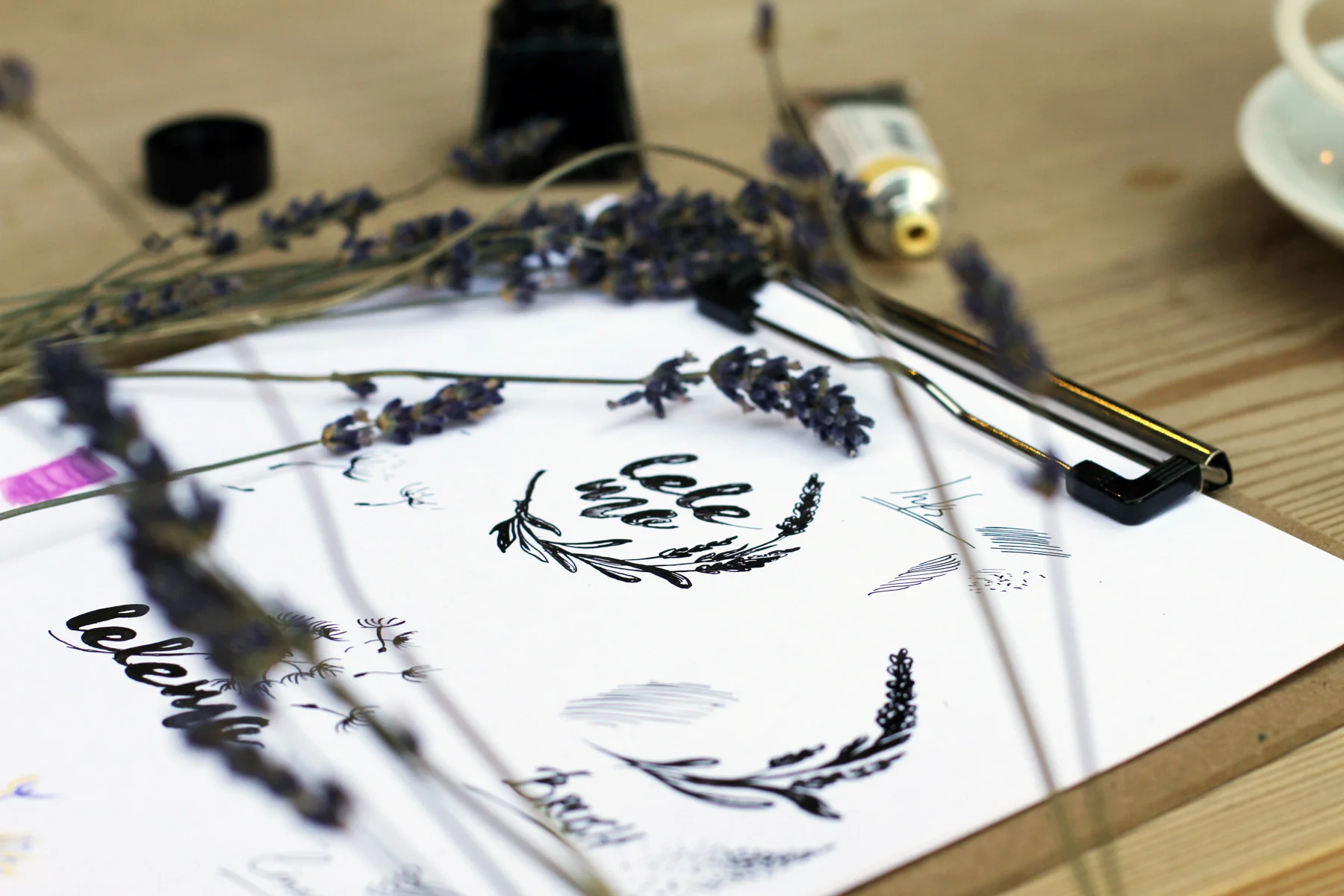
After several pencil sketches I determined the best one for this project. You can see the examples with pencil, classical nib pen, brush and inks.
Brush and inks
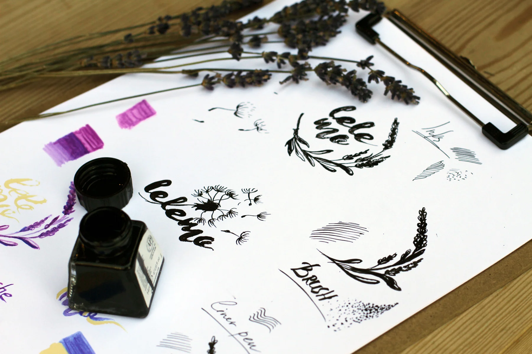
Liner pen
The process was smooth and I could switch the materials without worrying whether the paper could handle it. For most projects I use liners considering time spent and that nib pens can scratch the surface when working too hard.
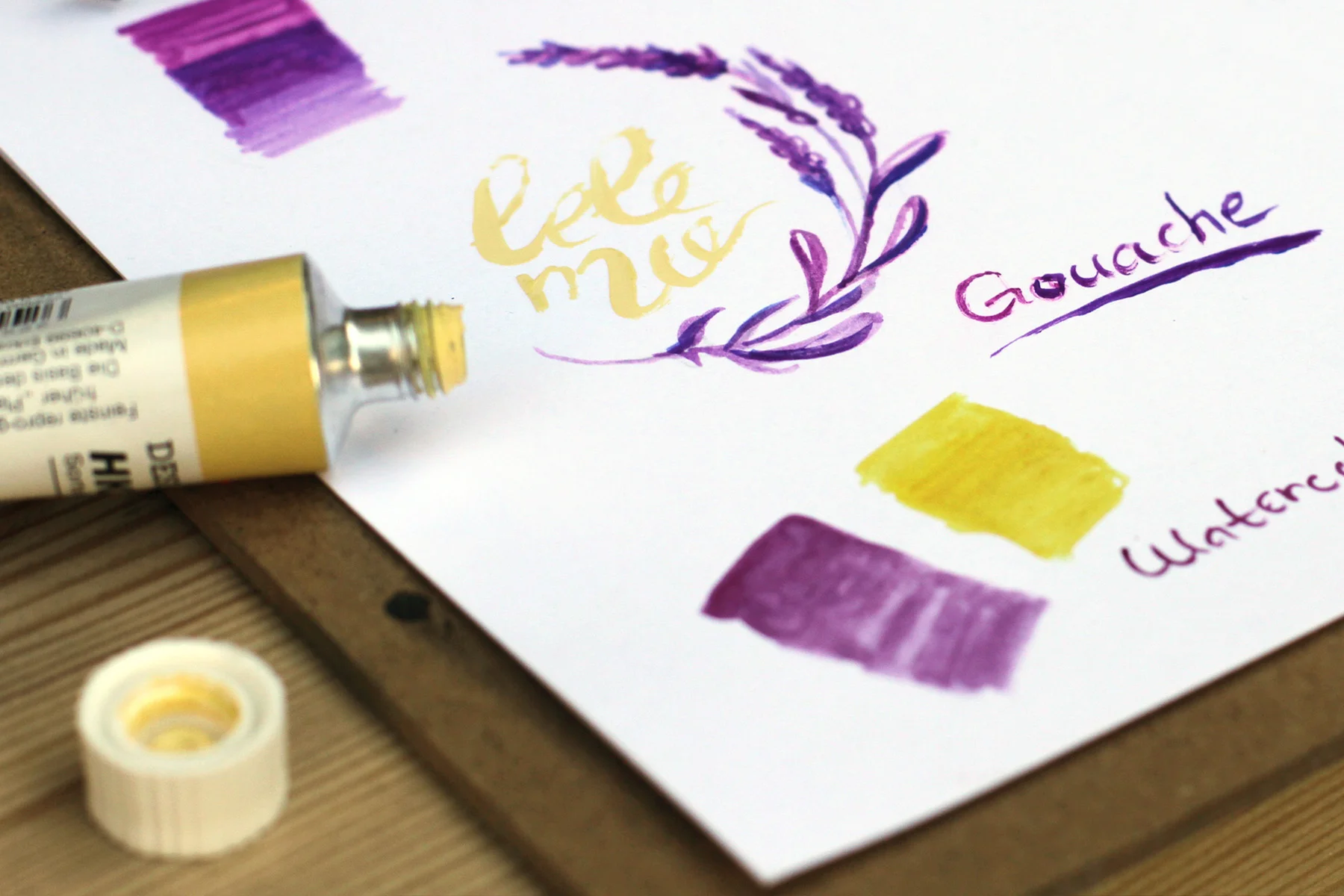
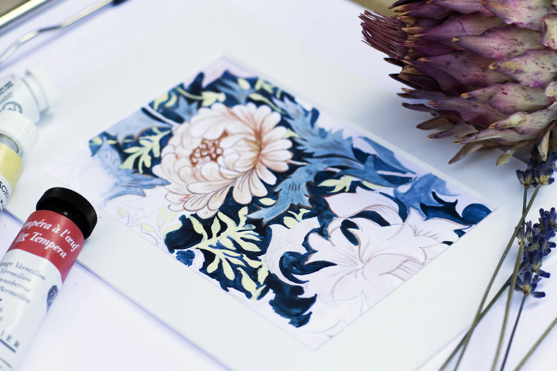
Adding some color tryouts before the computer postproduction is a very relaxing stage, there is little pressure so I tried both gouache and watercolor. Both paints absorbed quickly and dried quickly.
If you're working in a traditional multi-layering technique I strongly advise the use of specific paper (for acrylics, sumi-e, watercolors etc.), but for mixed media illustration project Bristol is perfect.
Time for scan and vectorizing. The bright white color of the paper allows for the easy scanning and isolating of subjects without elaborate post processing so all the last steps are usually made directly into Adobe Illustrator.
Layering opportunities
A big surprise was with layering opportunities.
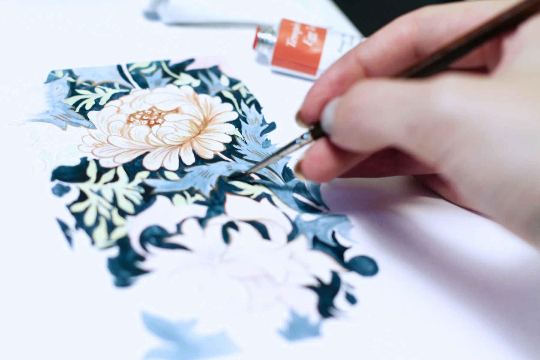
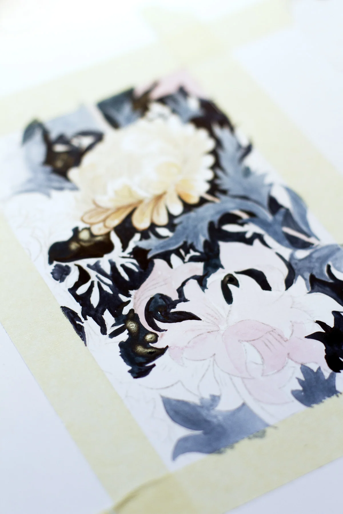
This is sneak peek of a watercolor and gouache project for my new Skillshare class I’m working on now. I just wanted to show how the paper holds the layers and you can surprisingly easily combine some elements of classical techniques with liners and whatever possible.
The only trouble I had was with a masking tape. After using lots of water, the tape removes the top layer of the paper. In illustration and design projects I don't often use the tape, but if you're working on for example floral watercolor painting with background, you'd better use some specific watercolor paper.
To sum everything up, Bristol paper is an indispensable assistant for quick and enjoyable illustration and design working projects.
Berlin.Stadt.Magazin Exhibition
My very Berlin'ish work selected for the group exhibition Berlin.Stadt.Magazin – 45 Jahre tip Berlin + 40 Jahre Zitty by the famous Zitty Berlin magazine and Tip Berlin at Neurotitan Gallery in Haus Schwarzenberg!
So excited to have my very Berlin'ish work selected for the group exhibition Berlin.Stadt.Magazin – 45 Jahre tip Berlin + 40 Jahre Zitty by the famous Zitty Berlin magazine and Tip Berlin at Neurotitan Gallery in Haus Schwarzenberg!
The exhibition is opened till 22 of April in the wonderful Hackescher Markt area. Check the opening video for the atmosphere:


Delft Blue Jubilee Invitation style
Hi guys! Just wanted to share the exciting project I was commissioned recently - invitation and stationary design for Jubilee celebration.
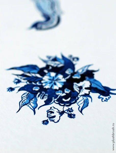
This project shows the idea of compilation Delft blue (Delftware) ornamental style and northern spirit of my native city Saint Petersburg. Here we have rather severe climate so atmospheric variety of the blue shades used in this famous Holland technique suits perfectly.
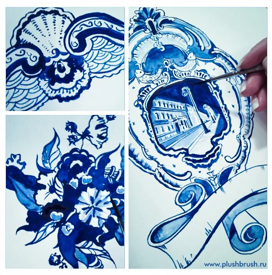
After browsing through different porcelain pieces some of which were really amazing and studying classical Delft patterns I’ve made several sketches. Wasn’t sure whether the designer paper (watercolor paper imitation) is available for printing so the two variations were made – with pattern and more ascetic and clean one, considering the paper texture will add the special feeling to the illustration.
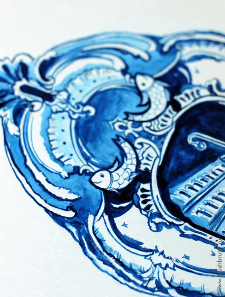
In the middle of the frame there is an old Palace of Vladimir Alexandrovich in which the celebration is taking part. The view of the building depicts typical Saint Petersburg central view near the Neva river.
I used Canson Montval watercolour paper size A4 and synthetic brush №2.
The style is about one chosen blue color so it was pretty easy to paint through the work. After pieces were finished I’ve scanned them and made a bit brightness/contrast tweaking in Photoshop.
Here are some photos of drawing process and preview of the result. The invitations are in printing house so probably will be able to grab couple of them soon.

This design is also planned to be a part of the gift hand painted on Royal Dutch porcelain box.
